File Information
| Downloads: | 644 |
| Date Posted: | 02-Aug-2013 9:40 PM |
| Created by: | deathcorenoise |
| Language: | English |
| Disc Number: | 1 |
 1 rating 1 rating |
Description
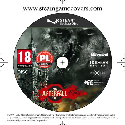
First disc I've done, goes with the cover. Custom disc. Wasn't 100% happy with this one, but I spent so long staring at it, and not being able to work out why I wasn't happy with it, I just gave up. Criticism Appreciated.Comments (5)
You must be logged in to rate covers and to post comments.deathcorenoise - 04-Aug-2013 7:16 AM
Why do the ratings need to be US? Personally I find PEGI to be more attractive, but that's just my personal opinion.
Why do the ratings need to be US? Personally I find PEGI to be more attractive, but that's just my personal opinion.
Razec - 04-Aug-2013 3:53 AM
What PieMonster said also though if you could use US based Logos for the rating etc. And make them just a bit smaller (not by too much).
Make the Logos on the right stack in 2 columns instead of all under each other.
And make the Afterfall Logo just a bit bigger.
What PieMonster said also though if you could use US based Logos for the rating etc. And make them just a bit smaller (not by too much).
Make the Logos on the right stack in 2 columns instead of all under each other.
And make the Afterfall Logo just a bit bigger.
PieMonster - 03-Aug-2013 9:00 AM
Ok, I think the size looks ok. If anything I would shift the logos so that they're centered between the edge of the disc and the edge of the guidelines. Example - the MS, DD, Intoxice, and NEG logos look a little too close to the right edge. I would move them all left a little. In truth, it's not that bad though.
Ok, I think the size looks ok. If anything I would shift the logos so that they're centered between the edge of the disc and the edge of the guidelines. Example - the MS, DD, Intoxice, and NEG logos look a little too close to the right edge. I would move them all left a little. In truth, it's not that bad though.
deathcorenoise - 03-Aug-2013 1:10 AM
The logos and the size/look of the game logo doesn't look right, but I couldn't quite put my finger on it.
The logos and the size/look of the game logo doesn't look right, but I couldn't quite put my finger on it.


