File Information
| Downloads: | 244 |
| Date Posted: | 30-Jul-2018 3:59 PM |
| Created by: | STEAMFan |
| Language: | English |
| Case Type: | Blu-ray |
| Cover Location: | Front/Wrap |
 5 ratings 5 ratings |
Description
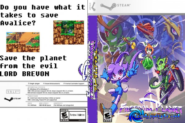
A custom made STEAM box art for the game , Freedom PlanetComments (6)
You must be logged in to rate covers and to post comments.calculon559 - 02-Aug-2018 5:49 PM
Pity you don't have a Hall Of Shame to put this in. Then again, it's probably a good thing we have so few truly terrible covers that we don't need one lol.
Pity you don't have a Hall Of Shame to put this in. Then again, it's probably a good thing we have so few truly terrible covers that we don't need one lol.
PieMonster - 02-Aug-2018 10:45 AM
Another few things I noticed - entire cover is resized, spine logo extends to the back of the cover, logo on front has additional text on it, Valve is not the developer/publisher yet are listed on the back, system requirements aren't same as on website, etc... Everything is wrong.
Another few things I noticed - entire cover is resized, spine logo extends to the back of the cover, logo on front has additional text on it, Valve is not the developer/publisher yet are listed on the back, system requirements aren't same as on website, etc... Everything is wrong.
PieMonster - 01-Aug-2018 4:41 PM
@DarkXess I don't think this is a troll. We occasionally get new users who create wrong covers. I usually remove them and send an email telling them of their mistakes. This cover is epic in that it makes every mistake you could make in creating a cover. I'd like to keep it around for a future tutorial I plan on making.
@DarkXess I don't think this is a troll. We occasionally get new users who create wrong covers. I usually remove them and send an email telling them of their mistakes. This cover is epic in that it makes every mistake you could make in creating a cover. I'd like to keep it around for a future tutorial I plan on making.
PieMonster - 30-Jul-2018 5:36 PM
Ouch! This cover is completely terrible. It does everything wrong - from not using a template to bad pixelated images. Also, the font and layout is just awful. This is the perfect example of how NOT to make a cover. I'm tempted to just leave it up.
Ouch! This cover is completely terrible. It does everything wrong - from not using a template to bad pixelated images. Also, the font and layout is just awful. This is the perfect example of how NOT to make a cover. I'm tempted to just leave it up.


