File Information
| Downloads: | 753 |
| Date Posted: | 14-Sep-2015 12:55 AM |
| Created by: | yo1dog |
| Language: | English |
| Case Type: | DVD |
| Cover Location: | Front/Wrap |
 2 ratings 2 ratings |
Description
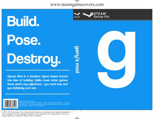
I was going for a very simple, minimal design (my first attempt at this style). Let me know what you think about the whitespace usage.The font used in the Garry's Mod logos and throughout this cover is Coolvetica:
http://www.dafont.com/coolvetica.font
The "g" on the front is one of the Garry's Mod logos. It is simply the lowercase "g" in Coolvetica.
"garry's mod" on the spine is the other Garry's Mod logo. Again, simply the text in Coolvetica.
"Build. Pose. Destroy." I think are the best 3 words to describe the game. The text blurb below that was taken from the front page of the Garry's Mod website (garrysmod.com).
I also created versions with a PC banner instead of the Steam banner and with no banner at all. You can find these and the PSD for this cover at the link below. I would have uploaded those here but the rules state that covers must include the Steam banner or they will be deleted. Feel free to edit and re-upload and do whatever you want with it.
http://s3.awesomebox.net/?p=/Box%20Art/Garry%27s%20Mod/

